Comic Panel Layouts: 7 Page Layouts and When to Use Each
The main comic panel layouts explained: grid, six- and nine-panel pages, widescreen tiers, splash pages, inset panels, manga reading order and webtoon vertical scroll, with real example pages.
A comic panel layout is the arrangement of panels on a page, and it controls how fast the reader moves through the story. The main layouts are the regular grid (six or nine equal panels), widescreen tiers, the full-page splash, inset and shaped panels, and the free-form "dynamic" page, plus two reading formats with their own rules: manga, read right to left, and webtoons, read as one long vertical scroll. Pick the layout from what the scene needs: more, smaller panels for quick action or comedy, fewer, bigger panels for a reveal or a quiet moment.
Below is each layout, what it does to the reader, and when to reach for it, with real pages as examples.
Why layout matters more than it looks
Readers do not notice a good layout; they just read at the speed you intended. Scott McCloud's Understanding Comics describes the gap between panels, the gutter, as the place where the reader's imagination does the work: two panels side by side make the reader fill in what happened between them. Layout decides how many of those gaps there are and how big the jumps feel.
Three levers do almost all of the work:
- Panel count. More panels per page means more beats and a faster read. Fewer panels means each one lands harder.
- Panel size. A big panel says "this matters." A thin strip says "keep going."
- Panel shape. Wide panels feel like film. Tall, narrow panels slow a moment down or show height and falling.
Everything else is a combination of those three.
1. The grid: six- and nine-panel pages
A grid page uses equal-sized panels in rows and columns, usually two across and three down (six panels) or three by three (nine). The grid is the most neutral layout in comics: it gives every moment the same weight and lets the content carry the drama.
The famous example is Watchmen, which uses a nine-panel grid throughout. The regularity creates a steady, almost clock-like rhythm, so when the book does break the grid, the break is a shock.
Use a grid for: conversations, comedy timing, slow tension, and any scene where you want the reader to watch small changes from panel to panel.
Watch out for: nine panels is a lot of art in a small space. Faces and dialogue need to stay readable, so keep descriptions simple and balloons short.
Our printable 6-panel comic strip template and comic panel template both include grid pages you can draw on.
2. Widescreen tiers
Widescreen pages stack three to five wide, short panels from top to bottom, each running the full width of the page. They read like frames of a film and are a staple of modern, "decompressed" comics, which spend more pages on fewer events.
Here is a page from The Last Bowl at Midnight, a manga made with ComicInk, built from four full-width tiers:
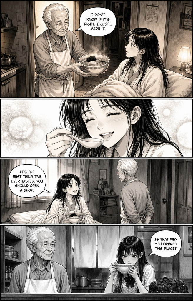
The wide panels give this flashback room to breathe. Each tier is a single beat (the bowl, the taste, the line of dialogue, the return to the present), and because every panel is the same width, the reader moves down the page at an even, unhurried pace.
Use widescreen for: establishing shots, emotional scenes, landscapes, and anything you want to feel cinematic.
Watch out for: widescreen costs pages. The same scene in a grid might take half the space.
3. The splash page
A splash page is a single image filling the whole page, sometimes with a few small panels laid over it. It is the loudest thing a comic can do, which is exactly why it should be rare.
Use a splash for: the first appearance of a major character or place, a big reveal, the climax of a fight, the final page.
Watch out for: a splash only works by contrast. If every other page is a splash, none of them land. A busy six-panel page followed by a splash is far stronger than two splashes in a row.
4. Mixed tiers and the full-width beat
Most real comic pages mix panel sizes: a wide top tier, two or three panels in the middle, a full-width panel at the bottom. This is the workhorse layout of American comics, and it is flexible because each tier can do a different job.
This page from Night Shift, an American Comics-style story made in ComicInk, shows the pattern:
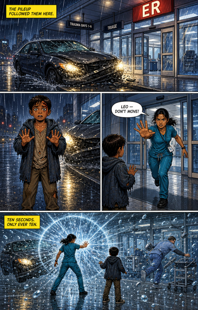
The top tier sets the scene. The middle tier splits into two panels so we see both characters react at the same moment, the boy frozen and the nurse lunging. The bottom tier goes full width for the payoff, the moment time stops. Reading top to bottom, the page goes from "where" to "who" to "what happens," and the biggest panel holds the biggest moment.
Use mixed tiers for: almost anything. When in doubt, this is the layout to start from.
5. Inset and shaped panels
An inset panel sits inside a larger panel: a close-up of a hand over a wide shot of the room, or a phone screen over a street scene. Shaped panels break the rectangle: circular panels for a view through binoculars or a keyhole, jagged borders for an explosion, soft or borderless edges for memories and dreams.
Use insets and shapes for: details the reader must not miss, point-of-view shots, flashbacks, and dream sequences.
Watch out for: insets cover part of the panel underneath, so make sure nothing important is hidden. Shaped panels lose their meaning if overused.
6. Manga: right-to-left reading
Japanese manga is traditionally read from right to left: the book opens from what a Western reader would call the back, panels run right to left across each row, and speech balloons are read in the same direction. Manga also tends to use more varied panel shapes and diagonal gutters, and to spend more pages on a single scene than Western comics do, with wordless panels for mood.
If you are making manga in English for an English-speaking audience, you can choose either reading direction; just pick one and keep it consistent for the whole book. Our printable manga panel template uses right-to-left reading order with diagonal gutters and bleed-edge panels, and the AI manga maker generates pages in Manga and Manhwa styles. For how manga storytelling differs from Western comics more broadly, see AI manga vs AI comics.
7. Webtoon: vertical scroll
A webtoon is designed for phones: one long vertical strip that the reader scrolls instead of a page they turn. There is no page shape at all, so layout becomes a question of spacing. Panels are usually full-width and stacked, and the white space between them works like a pause. A big gap before a panel is a beat of silence; panels close together read quickly.
Use webtoon format for: stories meant mostly for mobile readers, and for platforms like WEBTOON's Canvas, where anyone can publish a series.
Watch out for: a print-style page cut into strips rarely works as a webtoon. Plan for vertical scrolling from the start.
How to choose a layout for each scene
A simple way to decide:
| Scene | Layout to try | Why |
|---|---|---|
| Conversation | Grid or mixed tiers, 5–6 panels | Even rhythm keeps attention on faces and dialogue |
| Action | Mixed tiers with one large panel | Small panels build speed, the large one lands the hit |
| Reveal or arrival | Splash, or one very large panel | Size signals importance |
| Quiet or emotional moment | Widescreen tiers, 3–4 panels | Wide panels slow the reader down |
| Comedy | Grid | Equal panels make the timing of the punchline precise |
| Flashback or dream | Shaped or borderless panels | A visual signal that we are somewhere else |
Then look at your pages in pairs. A dense page followed by a sparse one creates rhythm; ten dense pages in a row exhaust the reader.
How layout works in ComicInk
ComicInk has no layout setting to pick from. The shape of each page comes from the script: how many panels the page has and how each panel is described. A panel written as a "wide establishing shot" comes out wide; a page with one panel is a splash. Most generated pages have between one and six panels, which is why pages like the two above use four.
So you lay out a page by writing it. Want a splash? Give the page a single panel. Want a calmer page? Use three wide panels instead of six small ones. Editing the script is free, and you can also ask Sidekick, ComicInk's built-in writing assistant, to "make page 4 a single splash panel" or "split page 2 into six panels."
If you are planning a comic strip rather than full pages, the comic strip maker works the same way at strip length. And if you want to sketch layouts by hand first, the free comic panel template has regular, irregular, full-bleed and splash-with-insets grids ready to print.
Quick checklist before you lay out a page
- What is the one moment this page must deliver? Give it the biggest panel.
- How fast should this page read? Fast means more panels, slow means fewer.
- Does the reading order work without arrows? If you have to explain it, simplify it.
- Is there room for the dialogue? Balloons need space, so plan them before the art.
- How does this page sit next to the one before it? Vary the rhythm.
Get those five right and the layout will mostly take care of itself.
Download the free template
A printable PDF companion to this guide — use it for your next script.
Download free comic panel templates (PDF)Ready to make your own comic?
A free account and 100 credits get you started. No drawing skills, no credit card.
Start your comicMore from the blog
How to Make a Comic Book in 2026: A Step-by-Step Guide
From idea to finished pages: free tools, AI generators, script templates, character workflow, and the publishing routes that actually work.
How to Make a Graphic Novel: A Step-by-Step Guide
How to make a graphic novel from idea to finished pages: premise, script, characters, page layouts and pacing, with 12 graphic novel ideas and a free printable template.
Comic Script Format: The Standard Layout, Explained
The exact format professional comic scripts use — page and panel numbering, panel descriptions, dialogue tags, caption boxes and the lettering annotations artists need.