What it looks like. Bold, clean black ink outlines with confident linework, flat cel-style colour and simple, punchy shading under dramatic lighting. It descends from the inked, flat-coloured superhero books sold at newsstands, and it is still what most people picture when they hear "comic book".
Best for. Action, adventure, crime and anything that should read fast and loud. It is also ComicInk's default style.
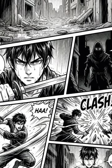
What it looks like. Black-and-white ink with screentones, cross-hatching, speed lines and cinematic panel angles. Manga is the Japanese tradition of serialised comics, and its rhythm, heavy on expression and motion, is why a story can run for hundreds of pages without wearing out.
Best for. Shonen action, romance, horror, sports and slice-of-life. Pair it with the manga page size (5 × 7.5 in). Pages are generated in left-to-right reading order.
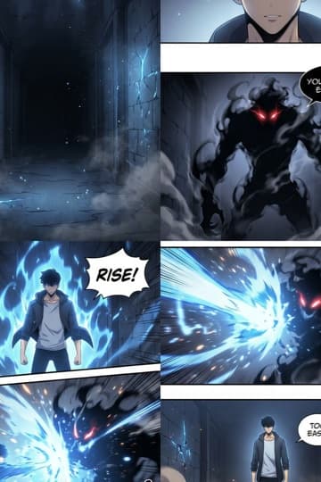
What it looks like. Full colour with soft gradients, polished line art that is cleaner than manga's, strong glow and lighting effects, and elegant, slightly realistic character design. Manhwa is the Korean webcomic tradition, composed with a vertical flow for reading on a phone.
Best for. Romance, fantasy progression stories, thrillers and school drama. Pair it with the 9:16 webcomic page size.
What it looks like. Clean, precise line art in the ligne claire or a semi-realistic register, detailed architecture and environments, and a natural palette that is never over-saturated. Bande dessinée is the Franco-Belgian tradition that produced Tintin, and it treats the setting as seriously as the characters.
Best for. Historical adventure, science fiction and literary stories where the world inside each frame matters as much as the cast.
What it looks like. Bright and bold: clean outlines, simple shapes, exaggerated expressions and playful proportions that stay readable at a glance. It borrows from newspaper strips and animation, where a gag has to land in a single glance.
Best for. Comedy, gag strips, all-ages adventure and talking-animal stories.
What it looks like. A photorealistic, cinematic finish: natural human proportions, detailed skin, fabric and surface textures, realistic lighting with reflections and shadows, and film-still depth of field. Expressions are grounded and subtle rather than exaggerated.
Best for. Drama, crime, historical fiction and character studies where credibility carries the stakes.
What it looks like. A dark, moody palette with selective colour accents rather than pure black and white, deep shadows from strong contrast lighting, and light sources such as neon, street lamps and window light. It borrows from hard-boiled crime fiction and 1940s film noir, with rain, fog and smoke in the frame.
Best for. Detective stories, crime drama and psychological thrillers.
What it looks like. Traditional watercolor handling: visible brush strokes and pigment flow, soft edges where colour bleeds, a textured paper background and a light, airy palette with minimal sharp outlines. It is the look of picture books and quiet memoir comics.
Best for. Fairy tales, memoir, nature and travel stories, and anything quiet where hard outlines would feel too certain.
What it looks like. Modern digital illustration at concept-art quality: smooth, clean rendering, soft gradients and polished shading, glow and reflections, semi-realistic proportions and crisp edges without heavy ink outlines. It looks current rather than printed.
Best for. Science fiction, urban fantasy, contemporary action and anything that should look current.
What it looks like. A 1950s–1970s pulp-print look: a slightly faded, limited palette, visible halftone dots and paper texture, bold line art with imperfect edges and the faint colour misregistration of offset printing. Shading is flat, with almost no gradients.
Best for. Pulp adventure, golden-age style heroes, 1950s science fiction and horror anthologies.
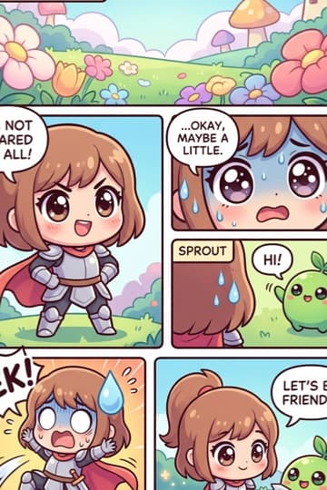
What it looks like. Super-deformed proportions: a very large head on a tiny body with short limbs, big highlighted eyes, soft rounded shapes and a bright or pastel palette. Chibi began as the comic-relief mode of Japanese manga and anime and became a style of its own.
Best for. Comedy, cosy slice-of-life, gag strips and all-ages stories.
Pixel Art
What it looks like. An authentic 8-bit or 16-bit game aesthetic: a visible square pixel grid with crisp edges, a very limited palette, no smooth gradients or anti-aliasing, and simple, blocky characters at one consistent pixel resolution across the page.
Best for. Game-inspired adventure, dungeon fantasy, retro science fiction and knowingly nostalgic comedy.